
Last week, famed Apple icon designer Susan Kare took the stand to testify on Apple’s behalf about the striking visual similarities between Apple’s iPhone and Samsung’s lineup of accused products.
While on the stand, Kare noted how even she herself was prone to confusion over the similarities between the two devices.
It is my opinion that the overall collection of graphic features that makes the overall visual impression could be confusing for a consumer. Partly I base that on my visual analysis. Partly, I remember when I was at the law firm about being a expert witness in this case there was a big conference table with many phones on it… I could see the screen and went to pick up the iPhone to make a point about the UI graphics, and I was holding a Samsung phone. I usually think of myself as someone who is pretty granular about looking at graphics, and I mistook one for the other. So, I guess in addition to my formal analysis I had the experience of being confused…
I found that the collection of features, graphical features that we just discussed, was present across all of these phones, to create in this set of screens the similar overall look that is confusingly similar to the phones on the left.
Kare had previously worked at Apple as a “Macintosh Artist” from 1982 through 1986, and since then, she has designed thousands of icons for hundreds of clients, including Apple, Microsoft, and even images she created for Facebook Gifts.
All told, Kare went on to say that Samsung’s accused products give off the same “overall visual impression” as Apple’s, from the look of the icons to the use of the anchored dock and the same use of a sans-serif font.
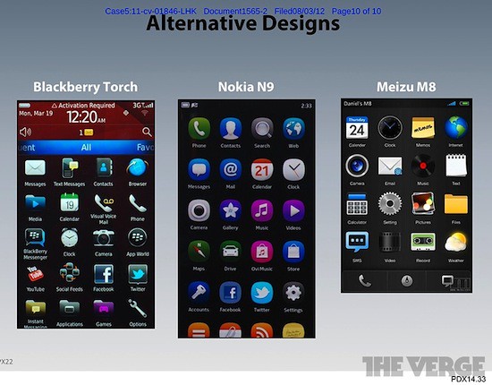
Further, Kare pointed out some icon gird alternatives that competing devices, such as the BlackBerry Torch were able to implement. In other words, Apple’s implementation is not the only viable implementation.
“It seemed to me,” Kare explained, “that all of these similarities… from phone to phone… was beyond coincidental… It seemed likely to me that Samsung used iPhone screen graphics as a guide.”
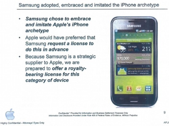
Below is an internal Samsung slide where they look to the iPhone for icon inspiration.

And as a point of interest, in case you’re wondering what kind of bank Kare is making by testifying on Apple’s behalf, she testified last week that she’s getting $550 an hour and has, to date, earned about $80,000.
More photos after the break.


 By all accounts, Apple will unveil the iPhone 5 on September 12 to be followed by an official launch 9 days later on Friday, September 21. And along with some schmancy new hardware, we’ll also see the release of Apple’s next-gen mobile OS – iOS 6.



Sun, Aug 12, 2012
Comments Off on Icon designer Susan Kare on Samsung’s iPhone-esque homescreen icons