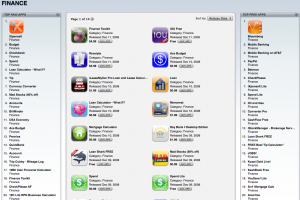
AppleInsider is reporting that Apple has adjusted the layout of the iTunes App Store to feature a broader range of applications, in addittion to separating the most popular apps into ‘paid’ and ‘free’ categories, and the improvements are apparent immediately.
For example, earlier this week, I clicked on the “Finance” category within the iTunes app store, and all I saw was a somewhat randomly generated grid of all the Finance applications that were available for download. I had to click on each individual app and check out the reviews if I wanted to get an idea of what users thought, and at most, I could sort them by popularity. But now, the Finance category gives me more options. On the left is a column listing the top 20 paid apps in the Finance category, and on the right is a column listing the top 20 free apps in the Finance category. Hallelujah!
While this isn’t a complete fix, it shows that Apple is taking the recent complaints about the App Store seriously, and is attempting to make browsing the store a more efficient experience for users.


Fri, Dec 12, 2008
News