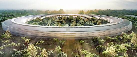
We’re not sure when newspapers began employing architectural critics, but they’ve sure been a lot more vocal than usual these days. Not too long ago, we highlighted how John Pastier, Mercury News’ architectural critic, lambasted Apple’s proposed plan for its new spaceship styled campus.
And now we have yet another architectural critic in Christopher Hawthorne who writes for the LA Times. Hawthorne seems a lot more stable than Pastier, who seemingly had an axe to grind with Apple given the tone of his piece, so let’s see what he has to say, shall we.
When Steve Jobs first presented Apple’s proposed plans to the Cupertino City Counsel, he employed his patented mix of hyperbole and enthusiasm that, taken together, is sometimes referred to as a reality distortion field. Never prone to understatements, Jobs touted Apple’s proposed new building as the “best office building in the world.”
Hawthorne, though, isn’t impressed:
Though the planned building has a futuristic gleam — Jobs told the council “it’s a little like a spaceship landed” — in many ways it is a doggedly old-fashioned proposal, recalling the 1943 Pentagon building as well as much of the suburban corporate architecture of the 1960s and ’70s. And though Apple has touted the new campus as green, its sprawling form and dependence on the car make a different argument.
And to a certain extent, I’m inclined to agree. It’s easy to get sucked into the hoopla of Apple’s spaceship-esque building, but is there really anything that innovative or futuristic about a circle?
But Hawthorne then veers off course when he takes Apple to task for allegedly keeping the architects behind the design under wraps.
One question the council members might have asked Jobs is simple: Who’s your architect? Jobs likes to promote the notion that he is personally involved in designing virtually all of Apple’s buildings — including the impressive Apple retail stores that first opened in 2001 and were largely produced by the architecture firm Bohlin Cywinski Jackson. In his appearance before the City Council he said Apple had “hired some great architects to work with — some of the best in the world, I think.” But he never mentioned the high-wattage name of Norman Foster or the London firm Foster + Partners, whose logo is stamped on the preliminary plans for the campus.
Who cares! As Hawthorne himself points out, Apple’s architectural plans are emblazoned with the Foster + Partners logo so what’s it matter if Steve Jobs didn’t explicitly mention them by name.
Hawthorne continues and calls Apple’s design “strikingly detached” of an anti-urban character.
When the designs first surfaced online, and a few critics noted their strikingly detached and anti-urban character, defenders of Apple responded by saying that those comments suggested a misreading of Silicon Valley’s history.
The more interesting question is whether a place like Cupertino can maintain its low-density sprawl in future decades, as the Bay Area’s population continues to grow, and whether the council’s enthusiasm for the new Apple headquarters can be read as an endorsement of a car-dependent approach to city and regional planning that might have made sense in the 1970s but will seem irresponsible or worse by 2050.
Relax people, it’s just a building.


Mon, Sep 12, 2011
News