By David Goldman:
OS X Lion ushered in a number of significant user interface changes with one of the more controversial debates centering on Apple’s decision to reverse mouse scrolling so that scrolling downwards takes a user to the top of a particular window – which is exactly how it works on the iPhone and iPad.
Another UI design Apple borrowed from iOS and transplanted into the latest OS X release is invisible scrollbars. In OS X Lion, scrollbars on a window are only visible when a cursor is placed on top of an active window.
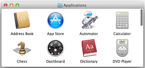
For instance, the window below appears to only have 8 applications.

But once a cursor is moved onto the window, the scrollbar appears.

So while Apple’s new implementation is ostensibly designed to create more window space and meld iOS and OS X together, there are some obvious downsides to this UI choice.
First, there is no way to tell at a glance how much content a particular window houses. While this isn’t a problem when browsing on a small device like the iPhone, the lack of information is certainly glaring when you’re using a big-screen iMac.
To keep Apple’s design in-tact while at the same time giving user’s pertinent and useful information Jon Whipple came up with a scroll compass that keeps everybody happy.
In the upper right corner of the window below you see what essentially looks like a D-pad. The highlighted portions of what Whipple calls the scroll compass tell the user that a window contains more content and exactly where. So in the example below, the highlighted portions of the compass inform the user that the window has more content to the right and downwards.

So when a user places the cursor over the window, wallah! Just as the scroll compass predicted.

And in keeping things consistent, once a user scrolls all the way to the right and downwards, the compass changes dynamically to indicate that more content is housed to the left and upwards.

So where can you download the scroll compass?
Nowhere, unfortunately.
This was just a theoretical study so don’t look for it anytime soon, or ever. And don’t expect Apple to implement it as they’re keen on stripping way UI features not adding more in.
A lot of interesting comments on the merits and downside to the scroll compass over here at Jettison Canopy.


Fri, Sep 2, 2011
News