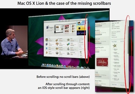
Apple’s somewhat brief sneak peak at Mac OS Lion hints at a revamped scroll bar UI for the upcoming iteration of OS X. During a presentation conducted by Apple VP of Mac OS X engineering Craig Federighi, we were able to see that Apple has, for the time being, abandoned the aqua scrollbars in favor of a grayscale choice that closely resembles the scrollbars on iOS. Moreover, the scrollbar would disappear altogether when there was inactivity on the screen, and would only reveal itself when an action resumed. Similar functionality was evident during demos of iPhoto and Safari, among others.
With OS X Lion not scheduled for release until the summer of 2011, it remains to be seen if Apple will exclusively stick with this UI choice or if the aqua scrollbars we’ve grown accustomed to will remain an option as well.

photo courtesy of AppleInsider


October 25th, 2010 at 12:44 pm
You wont find me complaining if they replace the standout aqua blue scroll bars with the more minimalist and less intrusive iOS designed model.
However, if they emulate the iOS implementation exactly, these scroll bars will only be used as a visual page view marker, not as a full use scroll bar that you can grab to drag your page view up and down with.
If they go with the former, they will end up relying much more heavily on only touch based inertial scrolling. Which for me, won’t garner a complaint, but I can see where some users may see it as a set back or a downgrade in functionality and versatility.
I’m curious to see how this pans out. Lion still has a long way to go before they tighten it all down.