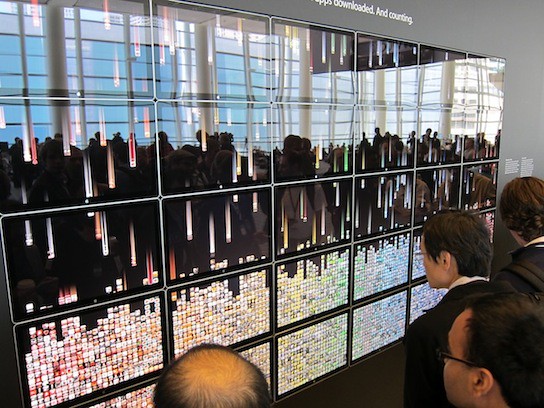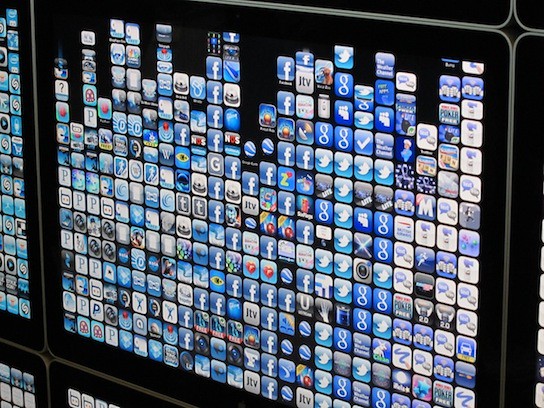
At last year’s WWDC, Apple wowed WWDC visitors with color-organized “app wall” display comprised of thousands of app store icons that pulsated each time a corresponding app was purchased on iTunes. This year, Apple upped the ante with a revised app wall that exchanged pulsating app icons for icons that dropped down from above, resulting in a Matrix style effect.
The new and improved app wall showcases the top 50,000 apps on 30 of Apple’s 24-inch LED Cinema displays. Each time an app is downloaded, its corresponding icon drops down from above onto a color coordinated stack. The display has a capacity of 10,800 apps and once that threshold is crossed, it resets and starts over from the beginning.
On the display, Apple explains how they set up the whole shebang:
How we did it:
This hyperwall is powered by 30 Mac Pro towers with Mac OS X Snow Leopard and EVGA NVIDIA GTX 285 graphics cards. As apps are downloaded from the App Store, their data is coalesced via an XML feed every five minutes. Apps are sorted and scheduled using Cocoa and Objective-C. The data is then passed to an OpenCL kernel, which drives the animation. Quartz Composer brings all the technologies together and renders the final synchronized output using Quartz Composer Visualizer.

via TechCrunch which has a lot more pictures worth checking out.


Mon, Jun 14, 2010
News