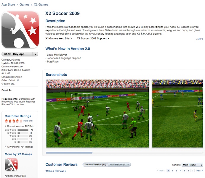
On Friday evening, Apple made some significant changes to the way individual apps pages are laid out on the iTunes App Store. As you can tell from the screenshot above, the app icon is now featured more prominently in the upper left-hand corner. Moreover, instead of having to click ‘next’ to view another screenshot of an app in action, users can now easily scroll to the right as all the pictures load up on the main app page automatically. This is an obvious improvement over the previous layout which required users to click a button in order to shuffle through the screenshots.
Also, you’ll notice that app description is truncated, though clicking “more” reveals the entire thing. From a developers point of view, this shift makes having appealing and eye-catching photos that much more of a necessity, while also stressing the importance of having kick-ass description. Also helpful is that the new layout now puts links to the developers site and support page at the very top. In addition, the “buy button” now includes links to share an app with friends either via Facebook or Twitter. This Twitter bidness’ sure is infiltrating everything, eh? And lastly, each app listing now includes, on the left sidebar, a list of all other apps made by a particular developer.
As a point of reference, this is how the old layout looked.
Photo courtesy of MacRumors.


Mon, Dec 14, 2009
News