Bruce Tognazzini was one of the first Apple employees, having been hired by Steve Jobs and Jeff Raskin in 1978 and remaining in their employ until 1992. Tognazzini might not be the most familiar name to Apple fans, but his work during his time spent at Apple continue to influence Apple design decisions today. Tognazzini helped found the Apple Human Interface Group, and published the first edition (and subsequently seven more) of The Apple Human Interface Guidelines. Long story short, Tognazzini is the man when it comes to interface design and usability, and with that short bio out of the way, Tog, as he’s often called, recently wrote an article detailing steps he feels Apple should take to improve the iPhone homescreen, which is otherwise known as the Springboard.
The main problem Tognazzini has with Apple’s current iPhone implementation is that there are simply too many great apps available, and it therefore quite a task keeping track of all of them, organizing them, and ultimately, being able to find the app you need as quickly as possible.
In light of his admitted app addiction, Tognazzini recently composed a list of suggestions to the iPhone interface that he feels would benefit users who download apps by the boatload.
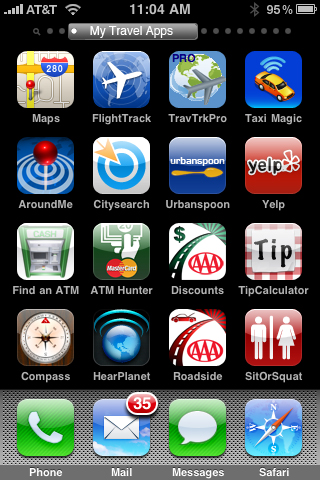
One of his ideas is to enable users to group certain apps by category, and label them appropriately for a quick scan through. In the mockup homescreen below, you’ll notice that all of Tognazzini’s travel apps have been grouped together and appear under the label, My Travel Apps. As the user flips through each subsequent iPhone screen, the labels will change to reflect the apps that reside therein.
 This is an interesting idea, but one problem we see is that not all groups of iPhone apps can easily be reduced down to 16 apps. Some groups might only have 9 apps, and some groups might have so many apps that the listing spills into half of the next page, rendering any labels either useless or too confusing.
Moreover, moving the grey cricles which denote which page of apps you’re on to the top of the iPhone screen just seems too messy and crowded.
Tognazzini, though, is full of ideas and while some of them may be more practical than others, he definitely comes up with some unique and creative ways to better the iPhone app browsing experience, such as enabling iPhone app screens to scroll vertically in addition to horizontally.
You can check out his entire list of suggestions, which also include user-controlled icon positioning and containers over here.
Call us crazy, but we’re of the position here at Edible Apple that the iPhone homescreen is just fine, especially now that users can adjust their icon setup quite easily with iTunes 9.
Think about it – each iPhone screen can display a maximum of 16 applications. That means that you instantly have access to 36 applications (including the home apps) with just one swipe of the iPhone. Now if you have 150+ apps, then sure, you might run into some usability issues, but again, you can easily make appropriate homescreen changes via iTunes.
On the same topic, Lukas Mathis’s of Ignore the Code breaks down some of the problems he sees with Tognazzini’s suggestions over here.


December 9th, 2009 at 4:04 pm
Alohi. Mi zer novazo. http://jestormani.net