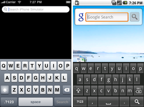
Ignore the code has an interesting comparison of the virtual keyboard as implemented on the iPhone and on the HTC Magic running Android.
His conclusion?
A virtual keyboard lives and dies by the details. It’s not that there’s a single feature which makes the iPhone’s virtual keyboard better than Android’s; it’s death by a thousand cuts. A number of small differences end up making a huge difference. Apple obviously spent a lot of time getting every little detail just right (well, except for the ducking dictionary), while Google decided to go ahead with what they had – which is usable, but no match for what the iPhone offers.
The entire article, though, is worth a read, and really highlights the important nuances of UI design.


Sun, Aug 9, 2009
News