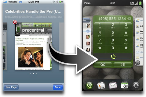
Video footage of the Palm Pre looks great. There’s no getting around it. One of the Pre’s most often-cited and touted features is its use of ‘Cards’ to navigate between applications. While certainly a cool feature, is it really any different than the way you navigate between Safari windows on the iPhone?
I only mention this because I’ve read a lot of ‘impressions’ over the past few days that praise this amazing new UI navigation. But after reading about how great ‘Cards’ is, I couldn’t help but think that I’ve seen the feature somewhere before.
Photo courtesy of The iPhone Blog


Fri, Apr 17, 2009
News